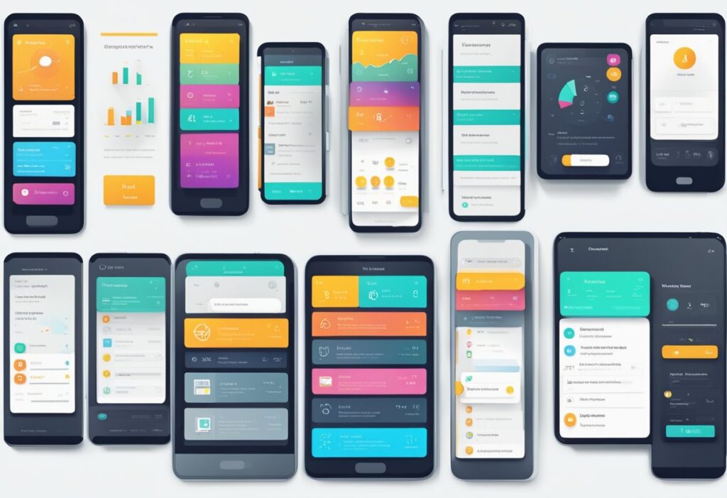
Designing for touch-based mobile interfaces requires a unique set of design principles to ensure usability and accessibility.
With the increasing popularity of mobile devices, it’s more important than ever to create engaging user interfaces that are intuitive and easy to use.
Understanding touch-based interaction is crucial for creating a successful mobile interface.
One of the key design principles for touch-based mobile interfaces is to prioritize simplicity and clarity.
Mobile screens are limited in size, and users interact with them using touch gestures, which makes it essential to present information and functionality in a clear and concise manner.
Designers should focus on streamlining the layout and navigation to make it easy for users to find what they need quickly.
Another important design principle for touch-based mobile interfaces is to create an engaging user interface that encourages users to interact with the app or website.
This can be achieved by using animations, transitions, and other visual elements that make the interface feel dynamic and responsive.
Designers should also consider the accessibility needs of all users, including those with disabilities, by incorporating features such as text-to-speech and high-contrast modes.
Key Takeaways
- Prioritize simplicity and clarity in the design of touch-based mobile interfaces.
- Create an engaging user interface that encourages user interaction.
- Consider the accessibility needs of all users when designing touch-based mobile interfaces.
Understanding Touch-Based Interaction
Touch-based interaction is becoming increasingly popular in modern electronic devices such as smartphones, tablets, and feature phones.
This type of interaction allows users to exchange information with machines in an efficient and reliable manner.
In this section, we will explore the basics of touch-based interaction, including touchscreen technology, designing for different devices, and touch gestures.
Touchscreen Technology and Sensors
A touchscreen is a display that can sense the presence and location of a touch within the display area.
There are two main types of touchscreens: resistive and capacitive.
Resistive touchscreens use two layers of conductive material separated by a small gap. When pressure is applied to the top layer, it makes contact with the bottom layer, creating a circuit.
Capacitive touchscreens, on the other hand, use a layer of glass coated with a conductive material. When a finger touches the screen, it creates a disturbance in the screen’s electrical field, which is detected by sensors.
Designing for Different Devices
Designing for touch-based interaction requires consideration of the different devices that will be used.
Smartphones, tablets, and feature phones all have different screen sizes and resolutions, which can affect the design of the user interface.
For example, a design that works well on an iPad may not work as well on a feature phone with a smaller screen.
It is important to consider the target audience and their device preferences when designing for touch-based interaction.
Touch Gestures and Multi-Touch Gestures
Touch gestures are a fundamental part of touch-based interaction. They allow users to interact with the device in a natural and intuitive way.
Some common touch gestures include tapping, swiping, pinching, and zooming.
Multi-touch gestures, which involve using two or more fingers at once, are also becoming more common.
These gestures can be used to perform complex actions such as rotating an image or zooming in and out of a map.
Designing for Usability and Accessibility
Designing for usability and accessibility is crucial when creating mobile interfaces.
This section will cover the thumb zone and ergonomics, accessibility considerations for elderly and disabled users, and usability principles for mobile UI.
Thumb Zone and Ergonomics
The thumb zone is the area of the screen that can be comfortably reached with the thumb. It is important to consider the thumb zone when designing mobile interfaces to ensure that users can interact with the interface easily and comfortably.
Ergonomics is another important consideration when designing for mobile interfaces.
Ergonomics refers to the design of products and environments that are optimized for human use.
When designing mobile interfaces, it is important to consider how users will hold and interact with the device to ensure that the interface is comfortable and easy to use.
Accessibility Considerations for Elderly and Disabled Users
Accessibility is an important consideration when designing mobile interfaces.
Elderly and disabled users may have difficulty using mobile interfaces, so it is important to design interfaces that are accessible to all users.
Some accessibility considerations for elderly and disabled users include providing clear and consistent navigation, ensuring readability and content accessibility, designing with color contrast in mind, implementing keyboard accessibility, optimizing for assistive technologies, and testing and iterating with real users.
Usability Principles for Mobile UI
Usability principles are important when designing mobile UI to ensure that the interface is user-friendly and easy to use.
Some usability principles for mobile UI include providing clear and concise information, using simple and intuitive navigation, designing with touch in mind, optimizing for mobile devices, and testing and iterating with real users.
Creating an Engaging User Interface
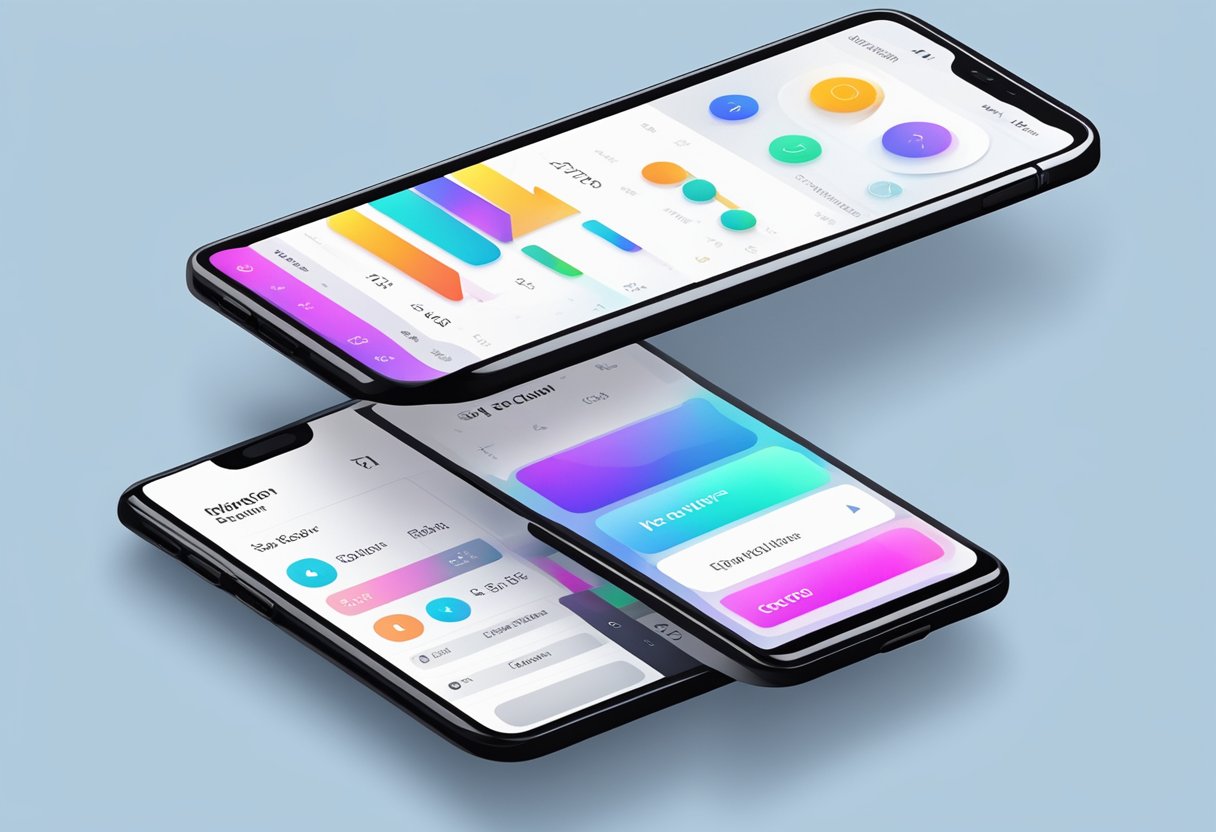
When it comes to designing a touch-based mobile interface, creating an engaging user experience is crucial. A visually appealing and immersive design can make all the difference in keeping users engaged and coming back to your app. Here are some key design principles to keep in mind when creating an engaging user interface.
Visual Design and Graphical Elements
Visual cues and graphical elements can be used to guide users through your app and make it more intuitive to use.
For example, using icons and imagery can help users quickly identify different features and functions. However, it’s important to strike a balance between using enough graphical elements to be helpful, but not so many that it becomes visually cluttered.
Responsive Design and Layouts
Responsive design and layouts are essential for creating a touch-based mobile interface that is easy to use on a variety of devices.
By designing with different screen sizes and resolutions in mind, you can ensure that your app looks and functions well on everything from a small smartphone to a large tablet.
Additionally, using responsive layouts can help ensure that your app is easy to navigate and use, regardless of the device being used.
Minimizing Visual Clutter
Minimizing visual clutter is another important aspect of creating an engaging user interface.
By keeping things simple and streamlined, you can help users focus on the most important features and functions of your app.
This can be achieved by using clear typography, plenty of white space, and a limited color palette.
Additionally, using animations and transitions sparingly can help create a more polished and professional feel.
Best Practices for Mobile Interface Design
Designing for touch-based mobile interfaces requires a different set of principles than designing for desktop or laptop interfaces. In order to create a seamless user experience, designers and developers must follow best practices that optimize the interface for mobile devices. Here are some best practices for mobile interface design:
Navigation and Menus
Navigation and menus are critical elements in mobile interface design.
Designers should prioritize simplicity and ease of use when creating navigation menus.
Navigation should be intuitive and easy to understand, allowing users to quickly find what they are looking for.
One best practice is to use a hamburger menu, which is a common symbol for a collapsible menu. This helps to save screen real estate and creates a clean, uncluttered interface.
Optimization for Different Platforms
Mobile devices come in different shapes and sizes, with varying screen resolutions and aspect ratios.
Designers and developers must optimize their interfaces for different platforms to ensure that the user experience is consistent across devices.
One best practice is to use responsive web design, which automatically adjusts the layout of the interface based on the device being used. This ensures that the interface looks good and functions well on any device.
Effective Use of Icons and Buttons
Icons and buttons are important elements in mobile interface design. They should be used sparingly and only when necessary.
Icons should be clear and easily recognizable, and should always be accompanied by text labels to ensure that their meaning is clear.
Buttons should be large enough to be easily tapped, and should be placed in locations that are easy to reach with the thumb.
In summary, designing for touch-based mobile interfaces requires a different set of principles than designing for desktop or laptop interfaces.
By following best practices for navigation and menus, optimization for different platforms, and effective use of icons and buttons, designers and developers can create interfaces that are intuitive, easy to use, and optimized for mobile devices.